• STORIES

A new burst of energy for the six-legged dog

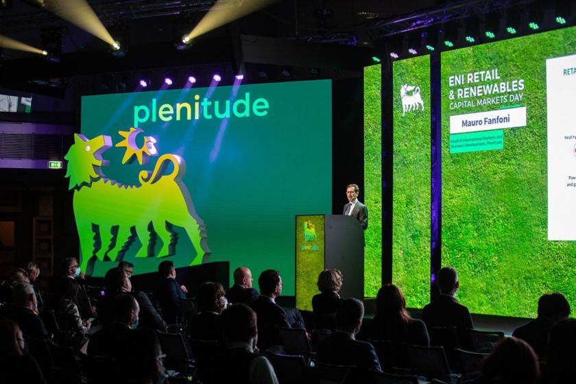
Plenitude event with logo projected on screens

For more than half a century the six-legged dog has been at Eni’s side, unleashing energy across the world. This year sees it being joined by a new companion: the logo depicting Plenitude, the company succeeding Eni gas e luce, combining renewables, the retail business and electric mobility.

Much remains recognisable, such as the head turned back and the elongated body. What makes the new logo distinctive is a green sun, which symbolises the group’s path towards the energy transition.

Presented at the Capital Markets Day on 22 November, Plenitude is built for the future on foundations rooted in tradition. This is communicated by the new logo (designed to complement the Eni logo) and echoed by the name (which, on closer inspection, contains the three letters: “Eni”). The concept was described more fully at the presentation itself as the path that led to Plenitude’s creation was outlined. 

Accelerating change together

“This is a key stage of our ongoing transformation,” said Claudio Descalzi, Eni CEO. “The energy transition is primarily a technological challenge. Developing and rapidly implementing proprietary technologies has given us a competitive advantage. And “in order to exploit these innovative solutions,” new tools are required from a company perspective too. That’s why the new company was conceived as a tool to accelerate the transition.

Plenitude is “at the forefront of Eni’s decarbonization strategy,” in the words of Stefano Goberti, CEO of the new company which aims to supply 100% decarbonized energy to all customers by 2040. In doing so it will support Eni’s targets of zero net Scope 3 CO2 emissions (those not produced directly by the company but indirectly linked to its activities, such as the use of the products it sells). And the position Plenitude occupies is important because it is the point through which energy flows directly into homes and companies. The new company will already have a portfolio of more than 10 million Eni gas e luce customers. It aims to increase that number to more than 15 million by 2030, leveraging “technologically advanced assets with a global presence” and “a wide range of soon-to-be-realised renewable energy projects”. For this reason, Goberti added, “we can be people’s best allies in tackling the energy transition”.

This is all reflected in the logo, designed specifically to symbolise a step forward. Branding is never just an aesthetic choice or a question of simple graphics – it shows exactly where a company is heading. The new brand standing alongside Eni (and explicitly recalling it) is a statement of how the new company will deploy the expertise and strength of the whole group. It will do so in the service of everyone coming together to make change possible.

Eni’s roadmap in one symbol

The brand had to reflect several key elements: it clearly needed to be international, given that in today’s environment the scale of such a choice involves a global perspective; it had to be straightforward and easy to pronounce, and not just in Italian; and it had to work well digitally, fitting in with requirements for the internet. Plenitude ticks all those boxes. Its name is both descriptive and evocative. It recalls the world of energy (evoking abundance and profusion, it suggests the possibilities that new energy sources can unlock) while representing the full extent of a global vision. All this with a logo that has a long history, having been familiar to Italians since the period of post-war reconstruction.

This year marks 70 years of the six-legged dog. It was launched in 1952 following a competition for ideas open to entrants across Italy. The competition was Enrico Mattei’s own initiative and ran in Domus magazine, which received 4,000 entries in response. At stake was 10 million lire in prize money. The jury was composed of communication professionals, artists and designers, and after 14 selection meetings they opted for an idea bearing the name of Giuseppe Guzzi. In reality, however, the design was by another famous artist, Luigi Broggini, who was reluctant to appear in what he deemed an “advertising campaign” (his name would only officially appear in 1983, after his death).

 The black dog breathing red fire, with the fuzzy hair on its back, a longer back than in today’s logo and a slight upwards incline (of “7°”, as the design stated), had six legs. They were intended to illustrate the “union between the four wheels of a car and the two legs of a driver,” explained Eni’s press office at the time; a sort of symbiosis that back then, on the eve of Italy’s economic boom, pointed towards the future.

With its expression of energy and optimism, the new design enjoyed great success.  It was initially intended for billboards and pumps for Supercortemaggiore petrol and Agipgas methane, then Agip’s top-of-the-range line of products. Instead it came to define the whole group’s identity, accompanying it throughout its subsequent evolution. Of those changes, the most significant was its global expansion: the six-legged dog, which in Italy was increasingly becoming the “driver’s best friend” (in Ettore Scola’s phrase), was now also growing into a global brand.

In the early 1970s it became apparent that the company had outgrown its image as a simple supplier of fuels. This called for a new approach to its logo. The solution came from Bob Noorda, a designer at the Unimark design firm. He was behind twin restylings (in 1972 and 1998) which blended the backgrounds and colours and subtly redesigned the dog itself, adding the name Eni and later the word Group, to emphasise that the brand now encompassed all the group’s activities.

The most recent change came in 2010. It updated the font and the six-legged dog so it was no longer contained within a yellow square, but breaking through it and upwards, to convey an openness to innovation, the future and an energy sector undergoing wholesale transformation.

Now this future is here, Eni’s legendary dog is looking ahead and is joined by a new element: the Plenitude logo brings with it the colours of new forms of energy which will drive the Group forward towards carbon neutrality.   

Those working on the logo kept one key idea front of mind. “We believe that people alone can change the world, acting together, through the choices they make every day.” Plenitude speaks to this idea, communicating a sense of closeness to people. In market terms, this translates into a unique offering, which, as Goberti emphasised, “combines renewable energy production with the sale of energy solutions and an extensive charging infrastructure network for electric cars”. In terms of people’s lives, it represents a companion for the journey – a helping hand to make the right choices. Choices that will help us all live better.

The author: Davide Perillo

Journalist, he currently deals with sustainability, social issues and Third Sector. He was director of Tracce magazine for 13 years. He is a member of the editorial staff of the Rimini Meeting (an international event for which he has managed numerous meetings), he was editor-in-chief of Sette......


Back to top
Back to top